Organization analytics
Last updated: Jun 30, 2026
Analytics sections are updated daily at 1:00 a.m. (UTC) from Monday to Friday. The values shown depend on preprocessed data updated Tuesdays through Saturdays at 7:00 p.m. (UTC). Please note that there may be brief periods after the Analytics update time when the section may experience a slight delay in data reflection.
Role required: User, Vulnerability Manager or Group Manager
The platform's Analytics sections display a set of graphs and figures that provide insights into your organization's security posture. The kinds of charts described below are only shown at the organization level.
Hover over charts to see available options.
Remediation rate benchmark
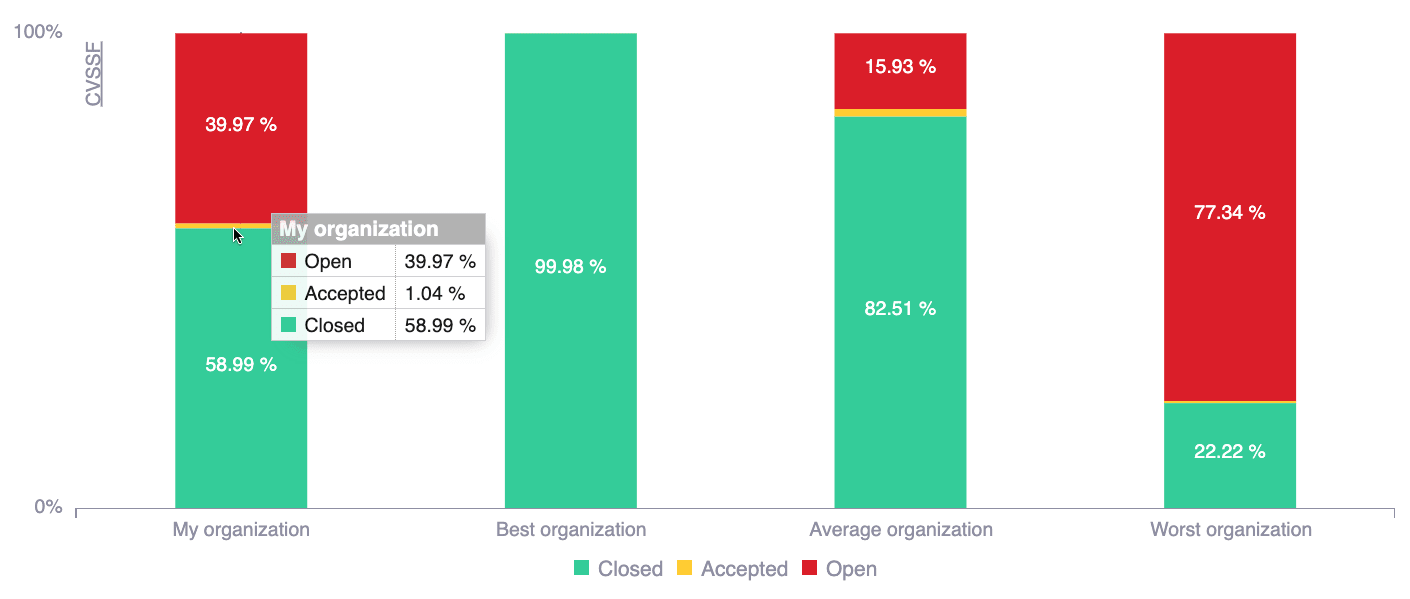
This chart shows the percentages of risk exposure (CVSSF) you have remediated (closed), accepted and awaiting remediation (open), according to the current status of the reported vulnerabilities that cause it.
For comparison, the chart provides this information for the best- and worst-performing organizations, as well as the average values across organizations. This chart helps you understand how your organization's vulnerability remediation efforts stack up against industry peers and create goals accordingly.
You can interact with the chart as follows:
- Hover over a bar to see the complete percentage information.
- Hover over a chart legend to highlight the corresponding portion in the chart.
- Click on a chart legend to hide the corresponding information from the visual comparison.
Remediation rate by group
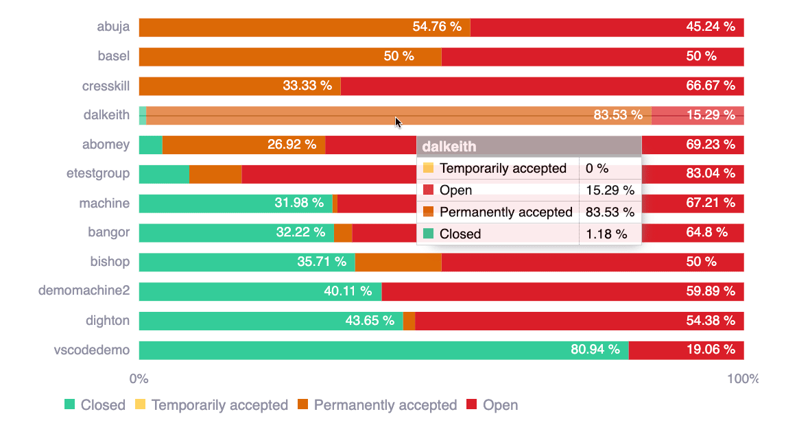
This chart shows the percentages of vulnerabilities that are closed (remediated), accepted, and open (not yet remediated nor accepted) for each group within your organization. This information helps you identify the development projects your team needs to prioritize for remediation.
You can interact with the chart as follows:
- Hover over a bar to see the complete percentage information.
- Hover over a chart legend to highlight the corresponding portion in the chart.
- Click on a chart legend to hide the corresponding information from the visual comparison.
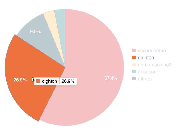
Open vulnerabilities by group
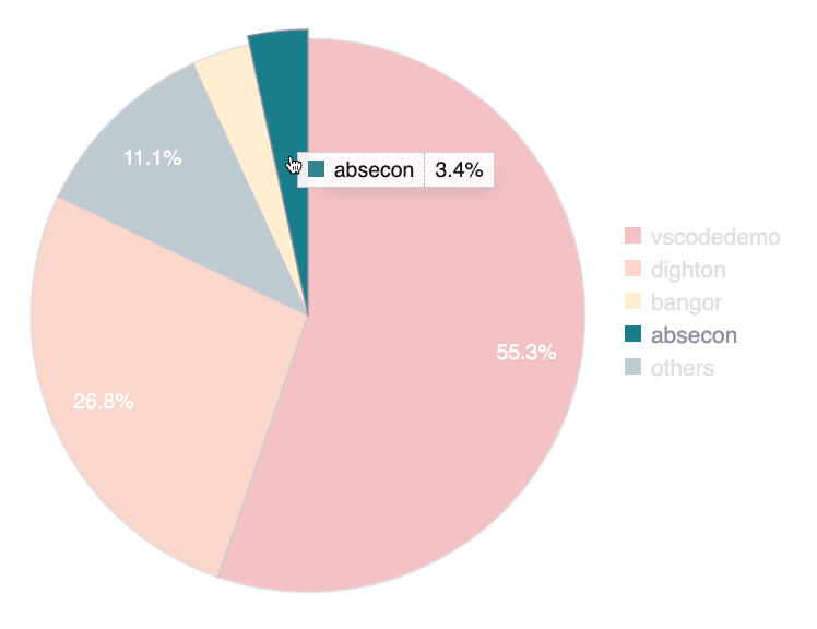
This chart displays each group's share of vulnerabilities that have not been remediated or accepted. This information helps you identify groups with a higher concentration of security issues so you can focus remediation efforts there.
You can interact with the chart as follows:
- Hover over a slice to see the group name and percentage information.
- Hover over a chart legend to highlight the corresponding slice in the chart.
- Click on a chart legend to exclude the corresponding group from the percentage calculation.
Undefined treatment by group
This chart displays each group's share of vulnerabilities for which a treatment has not been defined. This information helps you identify groups where the assignment of fixing work to team members should be prioritized.
You can interact with the chart as follows:
- Hover over a slice to see the group name and percentage information.
- Hover over a chart legend to highlight the corresponding slice in the chart.
- Click on a chart legend to exclude the corresponding group from the percentage calculation.
Exposure by group
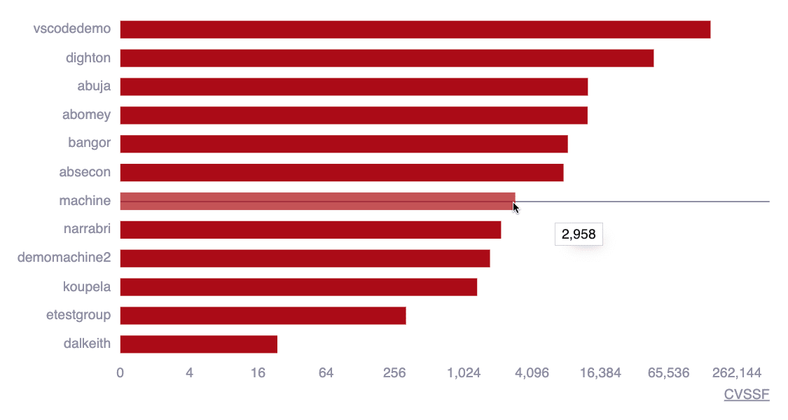
This chart displays each group's risk exposure level (in CVSSF units) from vulnerabilities that you have neither remediated nor accepted. This comparison helps you understand where information is most at risk of being compromised and prioritize remediation efforts accordingly.
This chart uses a logarithmic scale to display data for multiple groups effectively. Hover over a bar to see the precise risk exposure units.
Open weaknesses by group

This chart shows the number of vulnerability types in each group, corresponding to security issues that have not yet been remediated and are unaccepted. This helps decision-making regarding prioritizing remediation efforts.
Hover over a bar to see the precise amount.
A type of vulnerability refers to the category into which a detected security issue most likely falls.
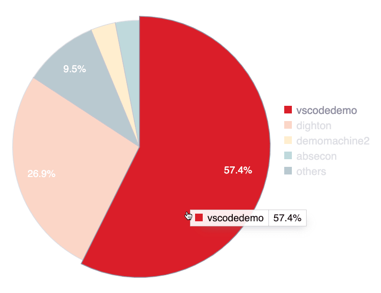
Vulnerabilities by group
This chart shows the share of reported vulnerabilities for each group relative to the total across the organization. This allows you to compare projects based on the number of security issues found.
You can interact with the chart as follows:
- Hover over a slice to see the group name and percentage information.
- Hover over a chart legend to highlight the corresponding slice in the chart.
- Click on a chart legend to exclude the corresponding group from the percentage calculation.
Unsolved events by group
This chart shows the number of unsolved events in each group of your organization. These are situations that prevent Fluid Attacks' tool or security experts from testing part or all of a group's scope. This information helps justify prioritizing some groups when addressing events to ensure complete vulnerability assessments.
Hover over a bar to see the precise number of events.
Weaknesses by group

This chart shows the total number of vulnerability types (aka weaknesses) detected within each group. This information helps you compare your projects based on the number of security issue categories encountered.
Hover over a bar to see the precise number of types.
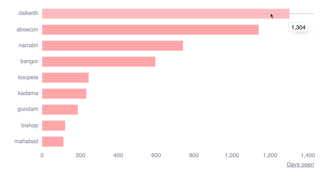
Oldest weaknesses

This graph provides the names of the types of vulnerabilities across your organization that have remained unmanaged for the longest duration (days). This helps you identify and prioritize long-standing issues.
Hover over a bar to see the precise number of days.
Overall availability time of groups
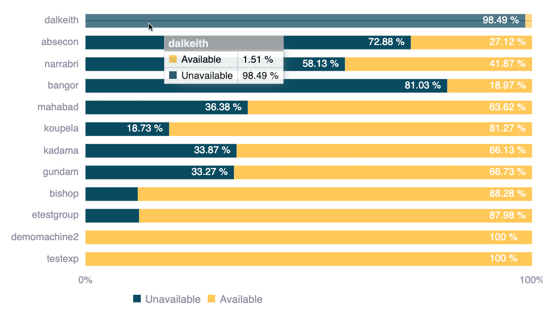
This chart shows the percentage of time each group within your organization has been impacted by events (i.e., situations that impede security testing) relative to each group's total lifespan. This allows you to identify groups that may need more care.
Hover over a bar to see its complete percentage information.
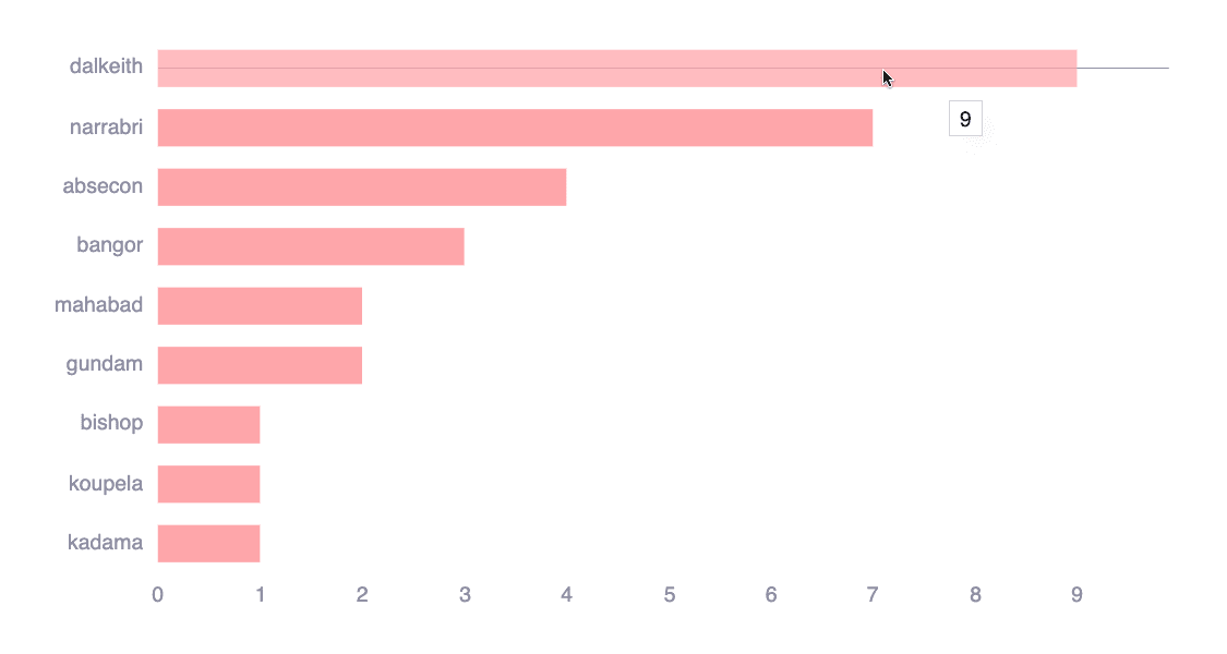
Days since groups are failing
This chart shows how long the oldest unsolved event has persisted within each group of your organization. Therefore, you can identify projects with long-standing issues that need urgent resolution to enable security testing.
Hover over a bar to see the exact number of days.
Tags by groups

This chart shows all the tags your team has created to identify vulnerabilities, along with the number of times each is used across the different groups in your organization. This helps you analyze security issues across your groups using categories that are especially significant for your team.
Accuracy SLA
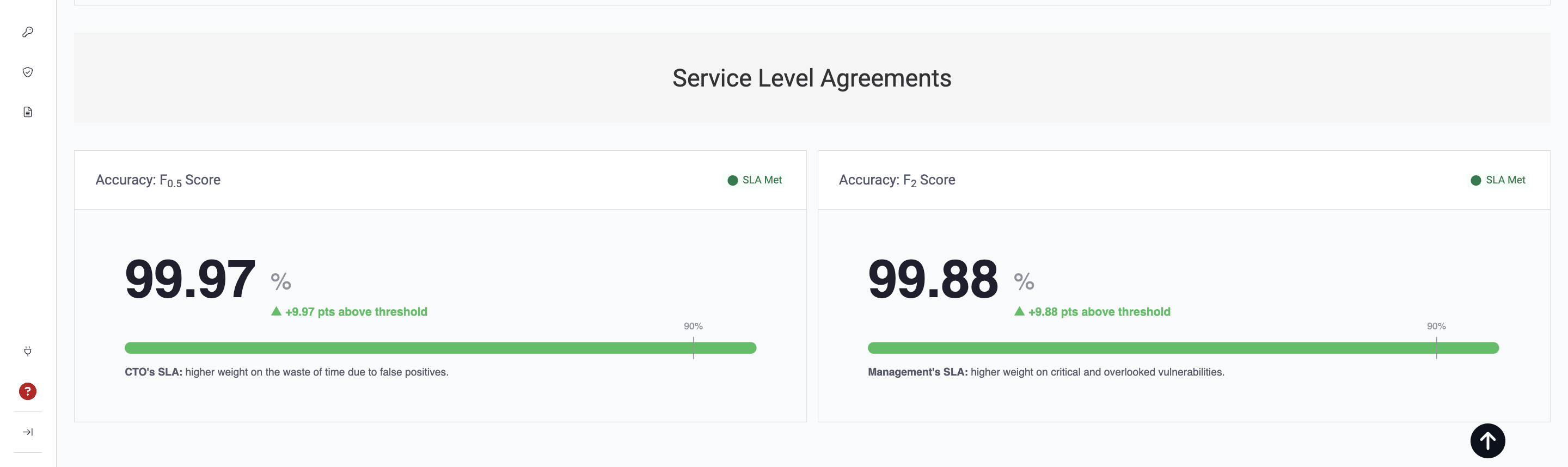
This indicator displays the current status of the accuracy SLA for your organization. It is visible to every customer with at least one group subscribed to the Advanced plan.
If a breach is indicated, make sure to also verify that the other factors of the accuracy SLA are met, such as whether a Health Check was performed on all group repositories.
Want advice based on Analytics? Try asking Fluid Attacks' AI Agent!
Search for vulnerabilities in your apps for free with Fluid Attacks' automated security testing! Start your 21-day free trial and discover the benefits of the Essential plan. If you prefer the Advanced plan, which includes the expertise of Fluid Attacks' pentesting team, fill out this contact form.
Common analytics
The Fluid Attacks platform provides shared analytics across the organization, groups and portfolios for actionable insights into your security posture.
Group analytics
Consult analytics on the Fluid Attacks platform to gain insights into the status of vulnerabilities and remediation practices of your group.